
By Thinkific
Order Bump

MY ROLE
Product Designer
OVERVIEW
I contributed to the design and enhancement of the Order Bump feature at Thinkific. This feature enables course creators to offer additional products or services at checkout, boosting revenue without disrupting the buyer's journey.
Challenge and keys responsibilities
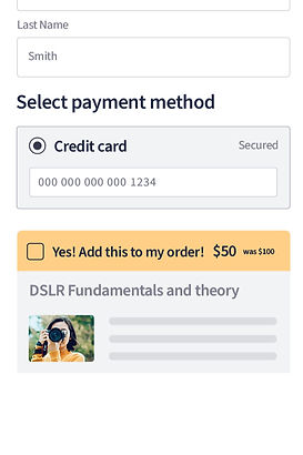
The primary challenge was to integrate the order bump seamlessly into the existing checkout process, ensuring it was both user-friendly and persuasive. The design needed to balance visibility with subtlety, encouraging users to opt in without overwhelming them.
Key Responsibilities
-
Conducted user research to identify pain points and opportunities within the checkout experience.
-
Collaborated with cross-functional teams to design intuitive, conversion-focused UI components.
-
Ensured accessibility and mobile responsiveness for a consistent user experience across all devices.
-
Implemented A/B testing to optimize the placement, design, and messaging of the order bump.
-
Developed a scalable design framework to accommodate various product types (e.g., digital downloads, subscriptions, coaching services).
IMPACT
The launch of the Order Bump led to an average increase in sales by 32% for Thinkific customers. The design was praised for its simplicity and effectiveness, making it easier for course creators to drive upsells without complicating the checkout process.
A unique and creative way to leverage the Order Bump feature is by requesting donations during checkout. One of our creators successfully implemented this strategy, similar to the "tip jar" concept at a coffee shop, offering students an easy way to show their support. This simple yet effective approach allows creators to receive voluntary contributions.

CHECKOUT
I conducted an accessibility audit on our checkout process to identify potential issues. One key flaw I discovered was that screen reader users could only access the total amount and products after entering all their personal information.

To improve this experience, we restructured the checkout flow during the Order Bump implementation. We adjusted the sequence so that customers could hear the product name, total amount, and any applicable order bump before inputting their personal details, enhancing both accessibility and clarity for all users.
