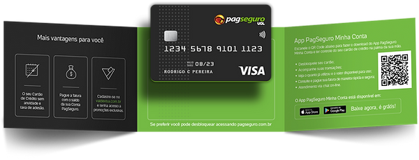
Launching PagBank's first credit card:
a Black-tier product for Brazilian small-business owners with damaged credit
PagSeguro Digital / PagBank

Table of contents

Context
PagBank had an active base of around 1.28M small merchants running an estimated R$3.2B in total payment volume through its point of sale (POS) terminals, digital account, and pre-paid card. But those customers were spending through third-party credit cards. The first PagBank credit card was conceived to close that gap and keep that revenue inside the ecosystem.
The business case came with a five-year financial model: 257,500 projected active customers, R$418M gross revenue, 39-month payback. And a timeline: internal pilot through 2017–2018, phased rollout to a controlled merchant population in Q1 2018, full public launch in 2019.
Currencies in this case study are in Brazilian Reais (BRL).
Problem

Before any design work could begin, three decisions already in the product spec were creating downstream risk:
-
Credit policy: traditional credit analysis would have rejected most of the user base, so the proposal was to approve them anyway but cap spending limits at $1k – 2k.
-
Auto-debit: a default-on, mandatory debit of the credit card invoice directly from the merchant's PagBank balance, framed internally as a differentiator.
-
Brand positioning: business wanted a status card to compete with the biggest competitor (Nubank's purple card), without the benefit package that would justify that tier.
None of these decisions were mine to make. But all of them were mine to inform.
My role
As a Strategic UX lead, I partnered with product owners, legal, compliance, and risk across seven engineering squads, to unpack the cards portfolio. I managed three UI designers divided between the credit card and the pre-paid card. My work covered discovery and insight synthesis, stakeholder alignment on the auto-debit and benefits-package decisions, UX coherence across the seven squads, and coordinating design deliverables for handoff.
Discovery and insights
To validate the spec, I ran a 20-question survey across three customer cohorts:
-
Active customers holding the pre-paid card
-
Active customers without the pre-paid card
-
Inactive customers with the pre-paid card
We had 459 respondents from 23,461 invitations, overall response rate 1.96%. The survey was followed by in-person qualitative interviews with current and prospective customers and a listening pass through call-centre recordings sorted by theme.

I synthesised the findings into a discovery deck mapping actual credit behaviour and unmet needs to product-spec implications. Those findings changed the direction of the project.
Assumption #1
The segment wanted a credit card, and were willing to accept a low spending limit.
The research showed customers were using credit cards as inventory financing, spending around $20k – 30k at competing banks. Any card that didn't meet their working-capital needs was explicitly discounted, which invalidate the assumption that $1k - 2k limit would be enough.
Assumption #2
The segment was aspirational, and tier would matter more than benefits.
Customers in this segment linked card tier to financial dignity. A premium tier was a status symbol, a validation of belongingness. That became the basis for challenging the positioning, and later, the foundation for the Black-tier brand strategy.
Card design research
Given the biggest competitors at the time, the expectation over branding were high and business had been leaning towards Black for status reasons. I felt the need for evidence whether customers’ perception of the benefits actually matched what a Black card promises.
I also co-led design research comparing three card colour directions across perceived premium-ness, status association, and segment fit.
Tying those findings to the dignity-signalling insight made the design decision defensible beyond aesthetics.

No Annual Fees
Higher Credit Limit
Discounts Anywhere
Reward Program
Special Payment
Others




What customers valued most

No annual fees
Higher
credit limit
Discounts
anywhere
Reward program
Special
payment

CARD DESIGN

+THAN


VARIATIONS
Results
I collaborated with product, legal, compliance, and risk stakeholders to address the findings and risks identified from my research.
For auto-debit, our call-listening sessions revealed the human cost of the proposed auto-debit policy. Pairing this with the regulatory exposure allowed us to successfully push for an opt-in model.
During the call listening sessions, in more than one situation, we had customers in emotional distress requesting immediate access to their frozen funds to pay for medications or hospital bills.
The outcome
-
Auto-debit was redesigned as opt-in. Customers in delinquency kept access to their balance; non-payment risk moved into interest and fees rather than balance withdrawal.
-
For the premium tier, the research validated the Black card hypothesis and gave business the confidence to commit to a benefits package that matched the tier.


Ecosystem consistency
For PagBank customers, pre-paid and credit aren't experienced as separate products, they were part of the wallet ecosystem. Any inconsistency across onboarding, statements, payments, or card management would hurt activation and trust.
The structural challenge was seven engineering squads working across the same mobile app and web platform, each with the potential to produce a different answer to the same surface. I mapped where the existing pre-paid flows and the new credit card flows overlapped, diverged, and needed to be reconciled, then applied a DesignOps approach to hold coherence at scale by leading the three UI designers as a single working group, sharing components, running joint reviews, and defining patterns across all seven squads as one product ecosystem.
Product owners and engineers were brought into that alignment early. The result was a unified card-product UX at the point of launch.
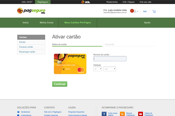
Existing pre-paid card flows
The pre-paid card flows already live on the web platform, used as the baseline for the credit card.

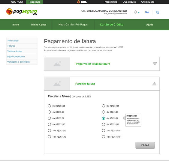
First iteration
Credit card flows built on the pre-paid patterns, including due date selection.
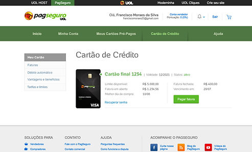

Second iteration
Pre-paid and credit cards brought together in one "My card" view.

App design
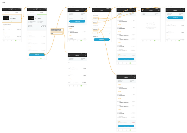
Mobile app flows for card activation and management.
Launch and outcomes
The phased rollout began in Q1 2018 with internal users and a few customers, followed by full public launch in 2019. The product shipped with a physical card, an opt-in media kit for auto-debit, credit limits aligned to micro-merchant working-capital needs, and a benefits package matched to the brand premise.
PagBank disclosed approximately 31M total customers by year-end 2023 and the credit card with limits up to R$100k from 2021, built on the foundation laid in this launch.
At this scale, UX design isn't just about great UI design. We were able to shape business logic, consumer policy, and align the product to be viable, ethical and built to grow with the customer base.